Friday, 24 May 2013

Final Piece Pt 2

Layer 2

For the top layer of my fabric i decided to use PVC which i have experimented with in my sketchbook. I have used acrylic ink in blue to draw my architecture sketches onto my fabric.
Adding detail to my drawings.


After i completed my drawings i decided to stitch into the fabric to make my sketches seem more 3D and to add more detail.


Close up of stitch detail


Final Piece - Top Layer


Final Piece Pt 1

Layer 1 

After having a small disaster with my final piece i began to re dye my fabric. I purchased Rit dyes in Purple, Sunshine Orange and Royal Blue. I mixed the colours, added them to spray bottles and began to dye my fabric to resemble my photograph. 


After dying I added bleach to brighten areas of the fabric.


Close up of bleaching process.


Once the fabric had dyed and the bleach had took effect it looked like this..


Wednesday, 22 May 2013

Blog Research

When i began to incorporate architecture into my work i took inspiration from images i had previously taken from a visit to Newcastle.


From these images i began to experiment with drawing buildings for my final piece. I decided to use Quink ink and water colour paints.


Even though i had primary research to develop my images from i still began to run out of inspiration for my building. I began to research blogs that focused on architecture and illustration.

Park Slope Sketch


Polly Fern Sergeant


Monday, 20 May 2013

Primary Research

Primary Photo's

For my primary research i have decided to document my own journey, I chose to focus on Manchester City centre at night. I was hoping to recreate something similar to the landscape artists I had researched only with my spin of the city rather than of the more rural scenery they had used. Whilst taking my photographs I decided to create movement to blur the images so all that was visible would be the city lights rather than the surrounding buildings.


Edited Photo's


 I was very pleased with the outcome of my images and I began to edit them straight away. I used a simple editing software called Fotor to change the brightness, contrast and to add filters, I mainly used the filter Real Illusion as I felt it really brought out the colours and enhanced the city lights.


Saturday, 18 May 2013

Journey


I have been given the theme of 'Journey' for my FMP. 

When exploring the theme of Journey i decided to look at it in a very literal way. I focused my research on designers that incorporate maps into their work, and designers that incorporate landscapes into their work.  
After researching designers i decided to scrap the whole concept of using maps and focused entirely on landscape designers.


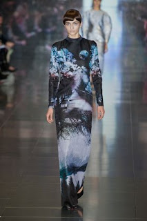
 Mary Katrantzou 


I found Mary Katrantzou to be the biggest influence on my work, she uses bold graphics infused with  splashes of colour which is an ideal concept for my final piece.